Wordmark Logo
Lettermark Logo
Emblem Logo
Abstract Mark

Combination Mark
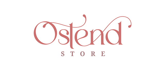
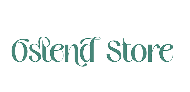
Wordmark Logo
A Wordmark is a text-based logo that focuses on the company’s name using a distinctive font, typography, and design style. It does not include symbols, icons, or mascots but relies solely on the lettering to create a strong brand identity.
Key Features:
Typography-Based – Uses unique fonts and styling to make the brand name stand out.
Minimalist & Elegant – Clean and professional look without extra visual elements.
Easy Recognition – Simple and straightforward, making it easy for customers to remember.
Versatile & Scalable – Works well across digital and print media in different sizes.
Best Use Cases for Wordmark Logos
Technology & IT Companies – Ideal for startups and software firms that want a sleek and modern identity.
Corporate Brands – Establishes a strong professional presence.
Media & Fashion Industry – Helps create a stylish and recognizable name.
New Businesses – Best for brands that want to build awareness around their name.
Lettermark Logo
A Lettermark (Monogram) logo is a typography-based logo that uses the initials or abbreviations of a brand’s name instead of the full name. It simplifies long company names into sleek, recognizable designs, making them easier to remember and visually appealing.
Key Features:
Initial-Based Design – Uses the first letters of the brand’s name (e.g., IBM for International Business Machines).
Minimalist & Professional – Clean, simple, and highly effective for branding.
Strong Brand Recognition – Ideal for businesses with long or complex names.
Versatile & Scalable – Works well in digital and print formats, even at smaller sizes.
Best Use Cases for Lettermark Logos
IT & Tech Companies – Perfect for modern and innovative businesses.
Corporate & Business Sectors – Great for finance, consulting, and legal firms.
Fashion & Luxury Brands – Provides a sleek, high-end feel.
Organizations & Institutions – Often used by government agencies, universities, and media firms.

Emblem Logo
An Emblem logo is a design that integrates text (usually the brand name or initials) within a symbol, badge, crest, or shield. It has a classic and authoritative appearance, making it a great choice for organizations that want to convey tradition, prestige, and professionalism.
Key Features:
Text Inside a Symbol – Unlike other logos, the text is enclosed within the design.
Classic & Timeless Appeal – Often used by heritage brands, educational institutions, and government agencies.
Highly Detailed & Intricate – Typically includes elaborate design elements for a prestigious look.
Less Flexible for Small Sizes – Due to its detailed nature, it may not always scale well on small digital platforms.
Combination Mark Logo
A Combination Mark Logo is a design that combines text and a symbol, icon, or abstract shape to create a complete brand identity. It allows for versatility, as businesses can use the text and symbol together or separately depending on their branding needs.
Key Features:
Text + Symbol – Combines a wordmark or lettermark with an icon or abstract symbol.
Versatile & Flexible – Can be used as a full logo or split into standalone elements (just the symbol or just the text).
Strong Brand Recognition – The symbol enhances visual identity, while the text ensures clarity.
Memorable & Unique – Allows for creativity while keeping the brand name readable.
Abstract Mark Logo
An Abstract Mark Logo is a unique, non-representational symbol that visually represents a brand without using recognizable images, icons, or letters. Instead of a literal depiction (such as an apple for Apple or a bird for Twitter), it uses geometric shapes, patterns, or artistic elements to create a distinct brand identity.
Key Features:
Symbolic & Unique – Uses creative, custom shapes to convey brand identity.
Versatile & Timeless – Works across different industries and platforms.
Memorable & Distinctive – Creates strong brand recognition without relying on text.
Emotion & Meaning Driven – Uses shape psychology and colors to communicate brand values.
Abstract Mark Logo
An Abstract Mark Logo is a unique, non-representational symbol that visually represents a brand without using recognizable images, icons, or letters. Instead of a literal depiction (such as an apple for Apple or a bird for Twitter), it uses geometric shapes, patterns, or artistic elements to create a distinct brand identity.
Key Features:
Symbolic & Unique – Uses creative, custom shapes to convey brand identity.
Versatile & Timeless – Works across different industries and platforms.
Memorable & Distinctive – Creates strong brand recognition without relying on text.
Emotion & Meaning Driven – Uses shape psychology and colors to communicate brand values.